
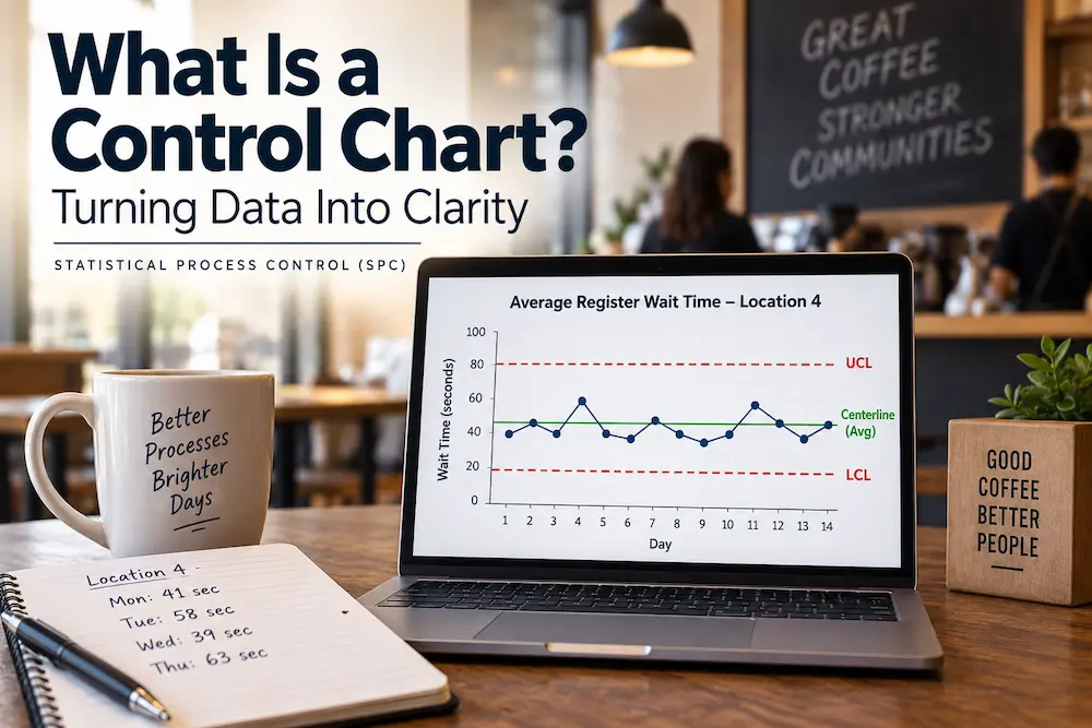
The regional manager for a small chain of coffee shops has a spreadsheet she updates every morning: average register wait time, by location, for the day before. Location 4 has been a headache lately. Monday it was 41 seconds. Tuesday, 58. Wednesday, 39. Thursday, 63. She's fairly sure something is wrong there, maybe the new hire everyone's been training, maybe the register software update from three weeks back, but every time she calls the store manager to ask about it, the answer is some version of "it varies day to day, I'm not sure what you're seeing." Neither of them is wrong, exactly. They're both just looking at the same numbers and unable to actually see what the other one is talking about.
This is the exact problem a control chart was invented to solve, and it's worth understanding what one actually is before ever getting near the formulas, because the idea itself is simpler than the name suggests. A control chart is a picture of a process telling you, in its own voice, what normal looks like, and flagging the moment it starts saying something different. Control charts are one of the core tools used in Statistical Process Control (SPC) to monitor process behavior over time.
What's Actually on the Chart
At its core, a control chart is nothing more exotic than a line chart, or line graph: the measurement of interest, wait time, defect count, response time, whatever the process produces, plotted in the order it actually happened, day by day or shift by shift. That alone is already more useful than a spreadsheet of numbers, because a spreadsheet makes you compare numbers in your head, while a chart lets you see the shape of the whole pattern at once.
What makes it a control chart rather than just a line chart is two additional lines drawn across it. A centerline marks the process's actual average. And a pair of limits, calculated from the process's own historical behavior rather than guessed at, mark the outer edge of what this specific process normally produces when nothing unusual is going on. The upper control limit (UCL) and lower control limit (LCL) define those boundaries. Data that lands between those limits is the process behaving the way it always behaves. Data that lands outside them, or that forms one of a handful of recognizable patterns even while staying inside them, is the process telling you something changed.
That's the entire idea. Everything else, which formula to use, how many data points to gather first, which type of chart fits which type of data, is detail sitting on top of that one core concept: stop eyeballing individual numbers, and instead look at the shape of the process over time against limits the process itself defined.
Why This Beats Staring at a Spreadsheet
The regional manager's actual problem wasn't that she lacked data. She had plenty. Her problem was that a single day's number, 63 seconds on Thursday, doesn't mean anything on its own. Sixty-three seconds could be a genuine problem. It could also be completely ordinary for a location that naturally swings between 35 and 65 seconds depending on which two employees happened to be on shift, how many people ordered complicated drinks that morning, and whether the espresso machine needed its scheduled cleaning cycle mid-shift. Without knowing the store's normal range, 63 is just a number that feels high.
A control chart answers that question directly, because it's built from the store's own history rather than from a manager's intuition about what "feels" too slow. If Location 4's calculated limits show its normal range running from about 30 to 65 seconds, then 63 seconds is well within the range this specific store produces on an ordinary week, annoying maybe, but not a signal. If the limits show a normal range of 30 to 50, then 63 seconds is genuinely something worth asking about. The chart turns a subjective argument, "it feels slow" versus "it varies day to day", into a shared, visual fact that both people are actually looking at the same way.
The Distinction That Trips Up Almost Everyone at First
There's one confusion worth clearing up directly, because it's extremely common and it changes how a chart should actually be read: the limits on a control chart are not the same thing as a target or a requirement.
A control limit is calculated from what the process itself has actually been doing. It answers the question "what does this process normally produce." A specification or requirement, on the other hand, comes from outside the process entirely, from a customer, a contract, a service standard, a brand promise, and it answers a completely different question: "what does this process need to produce to be good enough." These requirements may be expressed as an upper specification limit (USL) and lower specification limit (LSL), depending on what the customer or business requires. The requirements may also come from the Voice of the Customer (VOC), which is what the customer needs or expects from the process. A coffee chain might decide, as a brand standard, that 45 seconds is the requirement for an acceptable wait. That number has nothing to do with what Location 4's espresso machine and staffing pattern are actually capable of producing on a given Tuesday.
Mixing these two up leads to real mistakes in both directions. Treating a requirement as if it were a control limit means reacting anxiously to every measurement above 45 seconds, even ones that are completely normal for that store, which is exactly the kind of overreaction that makes a stable process worse rather than better. Treating a control limit as if it were a requirement is just as risky in the other direction: a process can be perfectly stable and predictable, humming along consistently inside its own control limits, while still being nowhere near what the brand standard actually requires. Stable and acceptable are two entirely different questions, and a control chart only answers the first one.
What the Chart Is Actually Flagging
A single point sitting outside the calculated limits is the clearest signal a control chart gives, and it's usually worth investigating right away. But a well-read chart catches more than that. A run of several points in a row, all sitting on the same side of the centerline, is a pattern real randomness rarely produces by accident, and it's often the first visible sign that something about the process has quietly shifted even before any individual point crosses a limit. The same goes for a steady trend climbing or falling across many points in sequence. None of these patterns require advanced statistics to notice once you know to look for them. They require actually plotting the data over time instead of only glancing at yesterday's number, which is the habit a spreadsheet never builds and a chart does automatically.
Where This Gets Technical, on Purpose Left for Later
Building a control chart correctly involves real technical decisions that genuinely matter and are worth learning properly rather than approximating. Different kinds of data, a measured quantity like wait time, a count of defects, a proportion of orders with an error, call for different chart types built on different underlying statistics. The limits themselves are calculated from formulas tied to the specific chart type and how the data is grouped, not eyeballed or set at a round number that feels reasonable. Getting any of that wrong doesn't just produce an ugly chart. It produces a chart that quietly gives false alarms or, worse, misses real signals while looking perfectly official.
None of that changes the underlying judgment this article is actually about: before reacting to any single number, ask whether it falls inside the range this process normally produces or outside it. A control chart is simply the disciplined, visual way of answering that question with the process's own data instead of a gut feeling, which is exactly the trap the common cause versus special cause distinction is built to prevent in the first place.
If you're not sure which control chart is appropriate for your data, our Control Chart Selection Tree Guide provides a simple decision tree to help you choose the right chart based on the type of data and how it is collected. It covers common chart types including X-bar, I-MR, p, c, and u charts and is available as a free PDF download.
Back at Location 4
The regional manager's actual next move isn't to demand an explanation for Thursday's 63 seconds. It's to plot several weeks of Location 4's data, see what its real normal range has been, and find out whether Thursday was ordinary or genuinely unusual for that specific store. If it turns out the store's whole pattern has quietly drifted upward over the past three weeks, a real signal worth investigating, the timing lines up suspiciously well with that register software update, and that's worth a phone call. If Thursday was just an ordinary bad day inside a wide, normal range that this particular store has always had, the better conversation isn't about Thursday at all. It's about whether that whole range, ordinary as it is for Location 4, is actually good enough to meet the standard the brand has promised its customers. That's a different, more useful conversation than either person was having before anyone looked at the shape of the data instead of a single day's number.
Frequently Asked Questions
1. What is a control chart, in plain terms?
A line graph of a process's measurements over time, with a centerline showing the process average and a pair of limits, calculated from the process's own historical data, marking the normal range that process produces when nothing unusual is happening. Points inside that range are ordinary variation. Points outside it, or certain patterns within it, are signals worth investigating.
2. What's the difference between a control limit and a specification limit?
A control limit describes what a process actually, historically produces. A specification or requirement describes what a customer or business needs the process to produce to be acceptable. They come from completely different sources and answer different questions, and a process can be perfectly stable within its control limits while still falling short of what a specification actually requires.
3. Why not just watch the raw numbers instead of building a chart?
A single number compared only to yesterday's number gives no sense of whether it's ordinary or unusual for that specific process. A chart shows the shape of many points over time against a range built from the process's own history, which turns "does this feel high" into a visible, shared fact rather than a guess.
4. What kinds of patterns should someone look for on a control chart?
A single point outside the calculated limits is the clearest signal. A run of several consecutive points on the same side of the centerline, or a steady trend climbing or falling across many points, are also worth investigating, since genuine randomness rarely produces those patterns by accident.
5. Are all control charts built the same way?
No. Different chart types exist for different kinds of data, a measured quantity, a count of defects, a proportion of errors, and each relies on its own underlying statistics and formulas for calculating meaningful limits. Choosing the right chart type and calculating its limits correctly is a real technical skill worth learning properly.
6. How does a control chart relate to process capability (Cp and Cpk)?
A control chart answers whether a process is stable and predictable. Capability asks a separate question: whether that stable process's normal range actually fits inside what customers require. A process needs to demonstrate stability on a control chart before a capability number like Cp or Cpk means anything meaningful. For a deeper explanation of process capability, see our Cp vs Cpk: Process Capability Analysis Explained.